Overview
Sparqube Picture Column is simple and intuitive component for uploading and displaying images in SharePoint lists.

Adding image to SharePoint list is as simple as selecting image from disk and clicking Upload button, all other steps will be done without any further manual interventions:
- Images are automatically linked with items;
- Large images are automatically resized to reduce image size;
- Images of rarely-used formats like TIFF or BMP are automatically converted to more web-friendly formats like JPEG or PNG;
- Thumbnails shown in list views are automatically generated and associated with original full-size image;
- Item display form will show images with predefined size limit.
Sparqube Picture Column is everything what "Hyperlink or Picture" column should be. There is no need to upload images to picture library manually, open it, copy URL and place it in URL textbox of "Hyperlink or Picture" column of item. Just choose desired images on your computer and upload them.

Features
- Upload images from local or network disk
- Support of any type of SharePoint list
- Linking of image to list item and automatically managing its physical location
- List view image display modes: Thumbnail and Link
- Feature-rich jQuery lightbox with carousel
- AddThis integration for sharing images in social networks
- Multiple images per list item
- Automatic image resizing on upload
- Automatic image format conversion
- Predefined image size in list view and item display form
- Ability to specify document library for storing images
- Filter by file extensions
Setup
Requirements
Server:
- SharePoint Foundation 2010/2013 or SharePoint Server 2010/2013
- Windows Server 2008/Windows Server 2008 R2/Windows Server 2012/Windows 7
- .NET Framework 3.5/4.5
Installation
Sparqube Picture Column requires the following permissions for an account running installation:
- Must be a member of the local server Administrators group to install application files.
- Must be a member of the SharePoint Farm Administrators group to deploy solutions to the farm.
To install Sparqube Picture Column:
- Run as Administrator self-extracting package Sparqube.PictureColumn.exe
- In confirmation dialog, click Yes to proceed with files unpacking
- In Welcome screen, click Next to begin the installation
- Verify that the system checks pass successfully. If all requirements are met, click Next to proceed
- Read and accept the End-User License Agreement
- Select one or more web applications to which you want to deploy Sparqube Picture Column
- Please wait for the setup to deploy the solution. Depending on your farm configuration it can take from 30 seconds up to 15 minutes. Click Next to continue
- Please check the details to see if solution was properly installed. Click Close to finish setup
Licensing
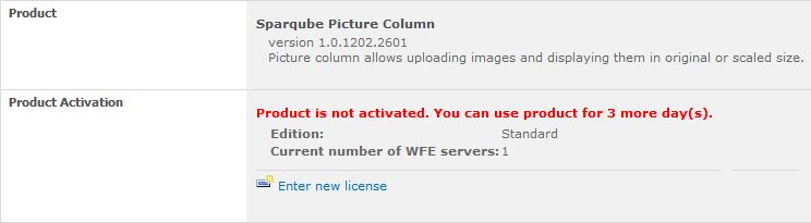
You can use Sparqube Picture Column for 3 days after installation without license. After that if you want to continue
using it, you should request free 30-days trial or buy a license.
Note: After evaluation period is expired, you cannot use the product. This will be indicated by the following
warning message: "Evaluation period has expired. Please activate the product". You can purchase Sparqube
Picture Column license at any time or you can request extended trial license by contacting
Sparqube sales department.
To activate Sparqube Picture Column on your SharePoint farm you need to:
- Install Sparqube License Manager
- Activate the license
Installing Sparqube License Manager
Download Sparqube License Manager from Sparqube Web site
and install it to Central Administration Web application.
Licensing and Activation
You can get Full or Development license key via purchase or request Trial license key via product Download
web page. License key is sent via e-mail and looks similar to the following: A1B2C3D-E4F5G6H-I7J8K9L-M1N2O3P.
License is activated using License Manager:
- Open SharePoint Central Administration
- Under Sparqube Configuration section, click Sparqube License Manager:

- In this page, you can see all installed Sparqube components and its license type and status.
Find Sparqube Picture Column and click it.

- In product detail page, you can see product information and licenses details. To activate
license click Enter new license

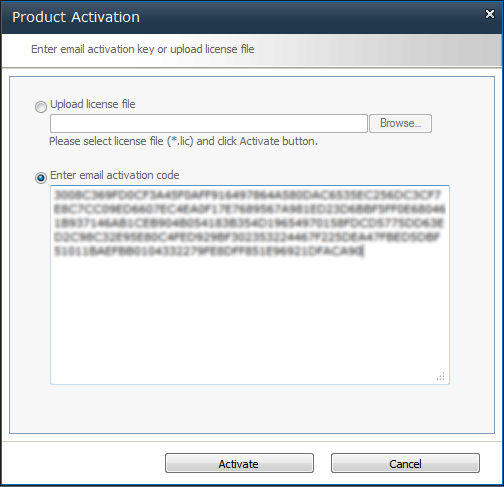
- If SharePoint server has internet connectivity you can activate online:
- In Product Activation dialog, click Activate online
- Enter license key and click Activate button

- You can also activate license via email.
- Click Activate via email.
- In Product Activation dialog, you can see SharePoint Farm ID. Clicking on email address
link in this dialog box will open new message window of your installed email client
in which you should enter your license key which you'd like to activate.
In case you do not have email client installed on your box you can simply copy Farm ID and
License Key and send an email from any other suitable machine to this address
sales[at]sparqube.com.

- After that, you will receive an email with activation code within 48 hours.
- To enter received activation code please repeat steps 1-4 and click Enter email activation.
- Enter email activation
- After successful activation, you can refer to License Manager page and check license details.

Configuration
Any number of Sparqube Picture Column can be added to lists, sites and content types like the standard SharePoint columns.
To add Sparqube Picture column to SharePoint list:
- Open existing list and add new column (In the ribbon, select List Tools tab > List > Create Column in Manage Views section)
- In the Column Name box, type a name for the column
- Under The type of information in this column is, click Sparqube Picture:


- In Picture Storage section, choose document library from current site or its folder where pictures and their thumbnails will be stored

- By default Picture column allows attaching one picture to list item. By checking Allow multiple values
checkbox, column can be switched to mode allowing attaching multiple pictures to list item. However,
please keep in mind that after switching to this mode column cannot be switched back to single picture per item mode.
- In File Uploading section:
- You can restrict specific file types from being uploaded. Check Enable filtering by file extension
option and type a comma-delimited list of allowed file extensions. Error will be shown when user will try to
upload a file of another file type, and file will not be saved.
- Select Automatically resize image on upload option and specify maximum width and/or maximum
height to automatically resize image to predefined size during image upload. If image size will be larger
than specified, it will be automatically scaled down to this specified size preserving aspect ratio.
- Sparqube Picture Column supports following image formats: JPEG, PNG, GIF, BMP and TIFF. BMP and TIFF are rarely
used in web ecosphere, so it is appropriate to convert them to more common web image formats like JPEG or PNG. This can be
easily done with Sparqube Picture Column on-the-fly during image upload. By default no image conversion is performed.
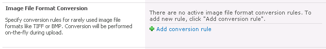
To add conversion rule click Add conversion rule, select source and target formats in drop-downs and click
Add button (green check). To cancel operation click Cancel button (red cancel sign).

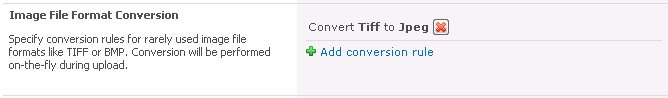
Wildcard rule can be added to convert images in any input format to one, for example to JPEG or PNG. During adding
conversion rule select "Any" in source format drop-down. This wildcard rule has lowest priority with respect to other
rules. To delete conversion rule click Delete button (red cross).
- There are two image display modes in list view: image can be shown as text link or a thumbnail.
- Link mode is useful when Allow multiple values is checked and list items contain several images.
This way list view is not cluttered with image thumbnails. Link text is formed from image description if nonempty or
file name. File name was not stored by Picture Column in versions prior to 1.2, in such cases generic text
"[picture]" will be shown.
- With Thumbnail mode, which is used by default, automatically generated thumbnail images are displayed.
Settings in this section allow specifying how thumbnails will be sized. Settings are identical to the settings in
Pictures in Item Display Form and are described in details in the following section.
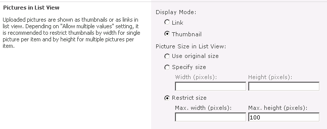
- In Picture Size in Item Display Form section, you can specify image size in list view and in item display form. You can choose one of the following options:
- Use original size - Select this option if you want the image to appear in its default size, which is the size specified by the image file's properties.
- Specify size – Select this option if you want to specify the size of the image. You can only set either the width or the height of the image, because the value that you choose for the image's width or height determines the value of the other dimension based on the original image aspect ratio.
- Restrict size – You can use this option to limit image size. You must set maximum width or maximum height, or both for the image by using the Max. Width and Max. Height properties.
- In Display Settings section, additional options can be set:
- Enable picture description – associates description text with pictures. This text can be specified
during item editing and is shown in lightbox.
- Enable lightbox – enables jQuery lightbox functionality which adds pleasant user experience while
viewing and navigating between images managed by Sparqube Picture Column. Lightbox is particularly useful since
it integrates image contextual commands like social network sharing with AddThis and ability to download image to disk.
- To enable AddThis integration expand AddThis Integration section and click Enable AddThis:
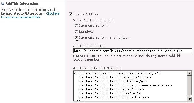
- AddThis toolbox can be added to Item display form, Lightbox or to both Item display form and lightbox.
AddThis toolbox will be shown automatically in the top left corner of the image when user will hover mouse over the image.
- AddThis toolbox requires native AddThis script to be loaded from AddThis website.
Valid AddThis account number is required for the script to run properly. Current suggested AddThis widget script version is 250.
Read more about AddThis integration on AddThis website.
- AddThis toolbox can be customized by changing toolbox HTML code. HTML can be configured on AddThis site and then copied and
pasted into AddThis Toolbox HTML Code input.
How to Use
Sparqube Picture Column works in two modes:
- Default mode when only one picture can be added to list item;
- Mode allowing multiple pictures linked to list item.
In single picture per item mode, adding picture to list item is quite straightforward.

In item creation or item editing mode click Upload Picture, browse to folder with desired picture, select file and
click OK in Upload Picture dialog.

If column option Enable picture description is enabled you could add picture description text. Clicking
Save list item with added picture will be saved.
If Enable lightbox column option is enabled, clicking on image thumbnail in list view will show lightbox with image
scaled to fit browser window. Picture description will be visible under the picture frame along with Close button (X).
Lightbox reacts to keyboard and can be closed by pressing Escape.

In multiple pictures per item mode, image editing is slightly different then in single picture per item mode.

Each picture is added by clicking Add picture.

Multiple pictures can be ordered by clicking Move Up and Move Down. Image can be replaced by another or
completely removed from list item by corresponding commands: Replace and Remove.
In multiple pictures per item mode, lightbox has additional controls which allow rotating between item pictures by
clicking Previous/Next buttons. Lightbox reacts to keyboard, and navigating to previous/next picture can be done by
Right/Left arrow keys. Quick jump icons appear when mouse cursor is hovering lightbox. These icons allow opening
immediately any picture inside lightbox.

Play button starts automatic image cycling.
When picture column thumbnail is clicked with Shift key pressed then shown lightbox will include all the images from all
Sparqube Picture Columns on the page. Additional button will be visible which will allow opening picture host item
(arrow pointing right).
Release Notes
Version 1.10
Changes (build 1.10.1702.1401):
- Added: Support for SharePoint 2016
- Added: Support of deployment to 14 hive on SP2013
- Fixed: Field value editing in Lookup Tracker form
- Fixed: Site with Picture site column export failed
- Fixed: Client scripts were broken when product was not licensed
Changes (build 1.10.1703.2601):
- Fixed: null reference exception for item display form in SP2016
Changes (build 1.10.1705.1601):
- Added: Meta-data fields for Picture Column containing multiple images
Version 1.9
Changes (build 1.9.1505.2101):
- Added: Column meta-data can be extracted to additional fields for Search
- Added: Limited support for sandboxed solutions
- Added: French translation
Changes (build 1.9.1507.301):
- Fixed: RTE editors broke after AJAX requests
Changes (build 1.9.1602.2801):
- Fixed: Unique permissions were not preserved when image was moved to Recycle Bin
Changes (build 1.9.1604.901):
- Fixed: Field control value was not updated when changed externally
Changes (build 1.9.1606.3001):
- Fixed: Thumbnail generation now ignores embedded thumbnails which are usually low-quality
Version 1.8
Changes (build 1.8.1401.501):
- Added: Multiple file upload
- Fixed: Items not updating in QuickEdit mode
Changes (build 1.8.1404.1801):
- Added: Images are now deleted to internal Recycle Bin
- Added: Option to allow anonymous upload
Changes (build 1.8.1409.1801):
- Changed: Improved image lifetime management logic
Changes (build 1.8.1412.1801):
- Added: Option to override aspect ratio and force resize
Changes (build 1.8.1502.1301):
- Fixed: Images were deleted when list items were updated by code or workflows
Version 1.7
Changes (build 1.7.1305.3101):
- Added: Browse feature for reusing existing images in several list items
Changes (build 1.7.1310.2501):
- Fixed: Crash when used in workflows
- Fixed: Lightbox jQuery conflicts
Version 1.6
Changes (build 1.6.1301.2101):
- Added: Right-to-Left languages support (RTL)
Version 1.5
Changes (build 1.5.1301.301):
- Added: Support for SharePoint 2013
Version 1.3
Changes (build 1.3.1210.2901):
- Added: AddThis integration
- Added: Image can be now downloaded from lightbox
- Fixed: Script and CSS files were not referenced properly
Version 1.2
Changes (build 1.2.1208.2801):
- Added: Display mode in list views (Thumbnail or Link)
Version 1.1
Changes (build 1.1.1206.2701):
- Added: jQuery lightbox
- Added: Multiple pictures per item
- Added: Format conversion
Version 1.0
Initial release (build 1.0.1205.2101)