Overview
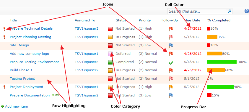
Sparqube Status Indicator is a unique tool that can display various visual cues depending on SharePoint
list item status or value. Using progress bar, graphics icons and color effects it can help you to keep track of
SharePoint list items, such as tasks, projects and items of other SharePoint list types. After assigning icons or color
category to different yet related items, the items are easier to identify and organize.

Sparqube Status Indicator supports following modes:
- Progress Bar
- Icons
- Color Category
- Cell/Row Coloring
- Countdown
Component is easy to setup – simply add it to SharePoint list, choose indicator mode and define display rules.

Features
- Percentage-based progress bar, including bar chart mode
- Graphic indicator with various icon sets
- Supports custom icons
- Cell and row color highlighting
- MS Outlook-like color categories
- Countdown for date fields
- Ability to define rules for dynamic indicator display
- [Today], [Now] and [Me] keys support in rule conditions
- SharePoint formula support to calculate indicator values
- Customizable indicator tooltip
- Supports any SharePoint list or library type
Setup
Requirements
Server:
- SharePoint Foundation 2010/2013 or SharePoint Server 2010/2013/2016
- Windows Server 2008/Windows Server 2008 R2/Windows Server 2012/Windows 7
- .NET Framework 3.5/4.5
Installation
Sparqube Status Indicator requires the following permissions for an account running installation:
- Must be a member of the local server Administrators group to install application files.
- Must be a member of the SharePoint Farm Administrators group to deploy solutions to the farm.
To install Sparqube Status Indicator:
- Run as Administrator self-extracting package Sparqube.StatusIndicator.exe
- In confirmation dialog, click Yes to proceed with files unpacking
- In Welcome screen, click Next to begin the installation
- Verify that the system checks pass successfully. If all requirements are met, click Next to proceed
- Read and accept the End-User License Agreement
- Select one or more web applications to which you want to deploy Sparqube Status Indicator
- Please wait for the setup to deploy the solution. Depending on your farm configuration it can take from 30 seconds up to 15 minutes. Click Next to continue
- Please check the details to see if solution was properly installed. Click Close to finish setup
Licensing
You can use Sparqube Status Indicator for 3 days after installation without license. After that if you want to continue
using it, you should request free 30-days trial or buy a license.
Note: After evaluation period is expired, you cannot use the product. This will be indicated by the following
warning message: "Evaluation period has expired. Please activate the product". You can purchase Sparqube
Status Indicator license at any time or you can request extended trial license by contacting
Sparqube sales department.
To activate Sparqube Status Indicator on your SharePoint farm you need to:
- Install Sparqube License Manager
- Activate the license
Installing Sparqube License Manager
Download Sparqube License Manager from Sparqube Web site
and install it to Central Administration Web application.
Licensing and Activation
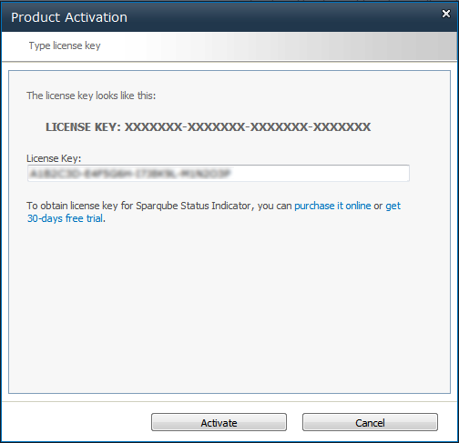
You can get Full or Development license key via purchase or request Trial license key via product Download
web page. License key is sent via e-mail and looks similar to the following: A1B2C3D-E4F5G6H-I7J8K9L-M1N2O3P.
License is activated using License Manager:
- Open SharePoint Central Administration
- Under Sparqube Configuration section, click Sparqube License Manager:
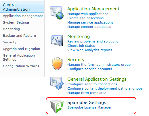
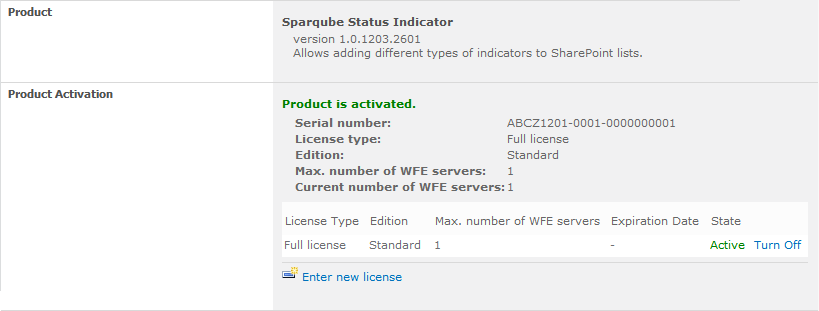
- In this page, you can see all installed Sparqube components and its license type and status.
Find Sparqube Status Indicator and click it.

- In product detail page, you can see product information and licenses details. To activate
license click Enter new license


- If SharePoint server has internet connectivity you can activate online:
- In Product Activation dialog, click Activate online
- Enter license key and click Activate button
- You can also activate license via email.
- Click Activate via email.
- In Product Activation dialog, you can see SharePoint Farm ID. Clicking on email address
link in this dialog box will open new message window of your installed email client
in which you should enter your license key which you'd like to activate.
In case you do not have email client installed on your box you can simply copy Farm ID and
License Key and send an email from any other suitable machine to this address
sales[at]sparqube.com.
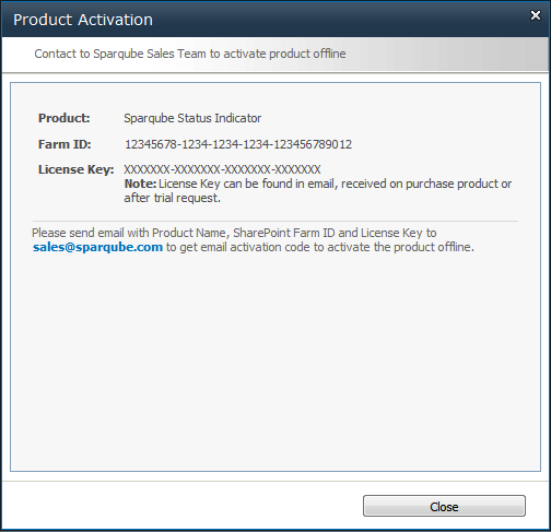
- After that, you will receive an email with activation code within 48 hours.
- To enter received activation code please repeat steps 1-4 and click Enter email activation.
- Enter email activation

- After successful activation, you can refer to License Manager page and check license details.
Configuration
Adding Sparqube Status Indicator to SharePoint list
Any number of Sparqube Status Indicator instances can be added to lists and content types same way as any other standard SharePoint column.
To add Sparqube Status Indicator to SharePoint list:
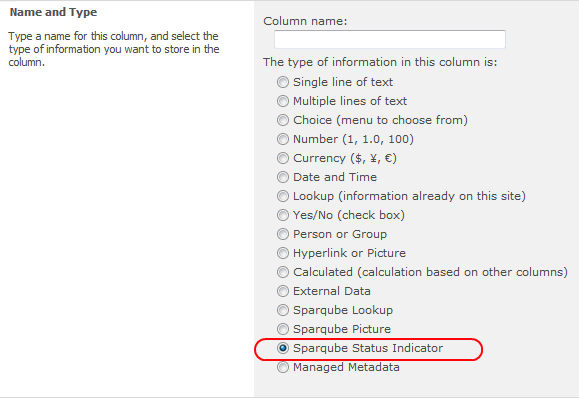
- Open existing list and add new column (In the ribbon, select List Tools tab > List > Create Column in Manage Views section)
- In the Column name box, type a name for the column
- Under The type of information in this column is, click Sparqube Status Indicator:
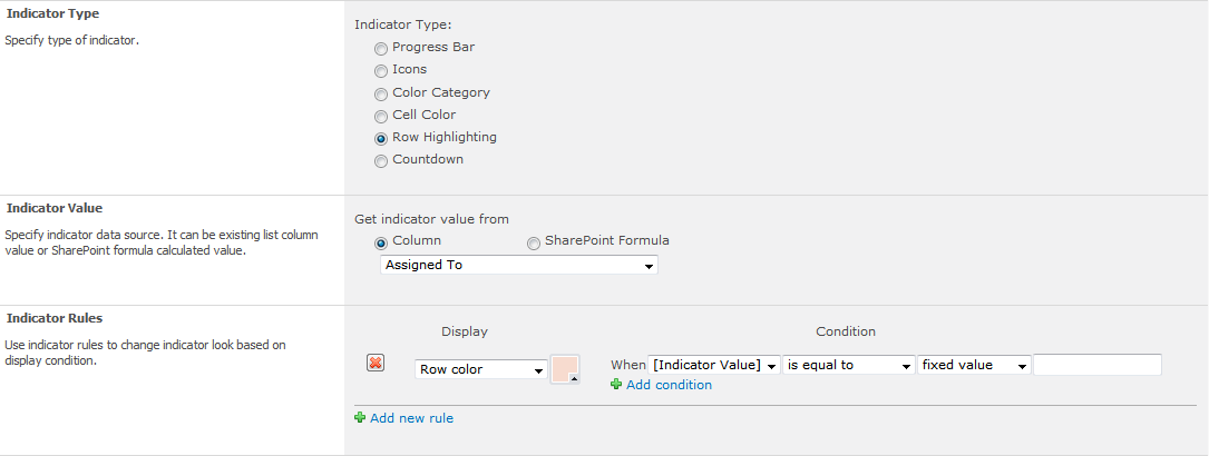
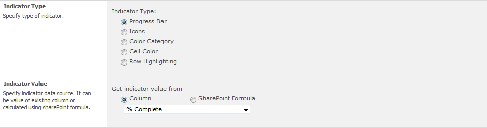
- In Indicator Type section, specify type of indicator

Possible options:
- Progress Bar
- Icons
- Color Category
- Cell Color
- Row Highlighting
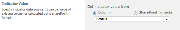
- In Indicator Value section, specify indicator data source. It can be existing list column value or SharePoint formula calculated value:
- Indicator View section allows specifying default display settings for indicator:

- Indicator Rules will help you to change indicator look based on certain condition. Each rule consists of two parts: display formatting and condition.
Rules are processed from top to bottom to the first rule for which its condition is true. Use up and down arrows to change the order in which the rules are processed. In display condition, indicator value can be compared to fixed value or to the value of other column. Following sample shows how to display different indicators based on choice columns:

- In Indicator Tooltip section, you can specify which value should be displayed in indicator tooltip. Possible values: none, current indicator value or value from any other column
- In Indicator Advanced Options section, specify how to show indicator in Display item form, and whether to show indicator column name header in list view

Important! To display indicator in list view, it is required to add this column to the list view.
Progress Bars
Progress Bar indicator allows displaying percentage column data of your SharePoint list.

In Indicator Value section, specify column with numerical source data or use SharePoint formula to return numeric value.
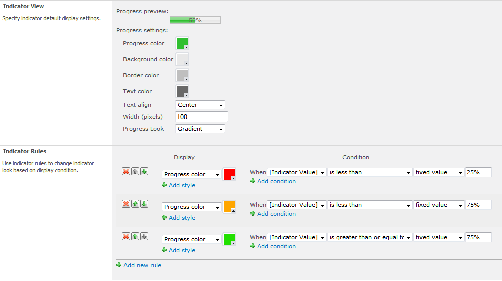
Use Indicator View section to specify progress bar default display settings, including:
- Progress color – color of the bar visually representing percentage
- Background color – background color of the progress bar
- Border color – color of the border
- Text color – color of the percentage text
- Text align – position inside progress bar where percentage value should be displayed. Possible positions: left outer, left inner, center, right inner or right outer
- Width – progress bar width in pixels
- Progress Look – progress bar look. It can be simple, with color gradient, or displayed as bar chart
In Rules section, you can change colors of progress bar, based on indicator value.

Icons
Icons indicator type can be used to display flags, status, stars and other icons in SharePoint list.

Indicator Rules section allows specifying icon displayed when certain condition is met. To add new rule, click "add new rule" link. In order to change existing rule icon, just click on it and select any other icon in Icon Picker dialog or type URL address of any other icon in URL box.

Color Category
Choose Color Category to display indicator value as color-coded bar similar to Microsoft Outlook color category.
In Indicator View, you can specify the following default settings of Color Category:
- Width – bar width in pixels
- Height – bar height in pixels
- Category Look – look of color bar. It can be solid background color or gradient color
Indicator Rules section allows changing bar background color based on certain indicator value.
Cell Color
Cell Color allows setting cell background or text color based on indicator value using corresponding Indicator Rules section. For example settings on the image below could be applied to Due Date of overdue tasks, which will have text color set to red.

Row Highlighting
Choose Row Highlighting to highlight whole item rows in list view. The following sample demonstrates how to highlight tasks that are not assigned to any specific person.
Countdown
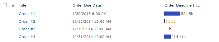
There are cases when date values should be tracked against other dates like dead-lines or due dates. Suppose the company's product orders are tracked via SharePoint. Records of orders have "Order Due Date" field containing future dates on which orders should be placed. For such cases it is a good idea to add Countdown indicator to the list, indicating how much time left to due date and highlight data if due date is approaching via Indicator rules.
Countdown option works with date values, so only date-time columns will be shown in indicator source drop-down.
Countdown has two display modes: for past dates and for future dates, depending on what behavior you desire to achieve. Also, it is possible to adjust Format and Display in which countdown will display calculated time values.
The following screenshot demonstrates Countdown set to highlight information on approaching dates: countdown for dates closer than three days will have yellow text color and indicator for dates closer than one day will have red color.

Resulting list will look similar to this:
Use Cases
Displaying percentage columns as progress bars
The following sample displays how to configure Status Indicator to display Task’s "% Complete" column as progress bar.
By default, SharePoint tasks are displayed as in the view below:

In order to add percentage-based progress bar instead on Number column, follow next steps:
- Add new column to Tasks list and set column name to "% Task Complete" (or any other, for example "% Complete" – with 2 inner spaces to avoid naming conflict with original "% Complete" column containing source value) and set column type to Sparqube Status Indicator
- Set Indicator Type to Progress Bar
- In Indicator Value section, choose Column option under Get indicator value from box and choose "% Complete" column in drop-down list:
- In Indicator View section, specify appearance settings like colors, text alignment, size and look
- In Indicator Rules section, we have added some rules to change progress color based on percentage value:
- After column is created, modify Tasks view and replace "% Complete" column with "% Task Complete" newly created indicator column by hiding "% Complete" and showing "% Task Complete":

After that Task view will look the following way:

Follow-up flags for Task
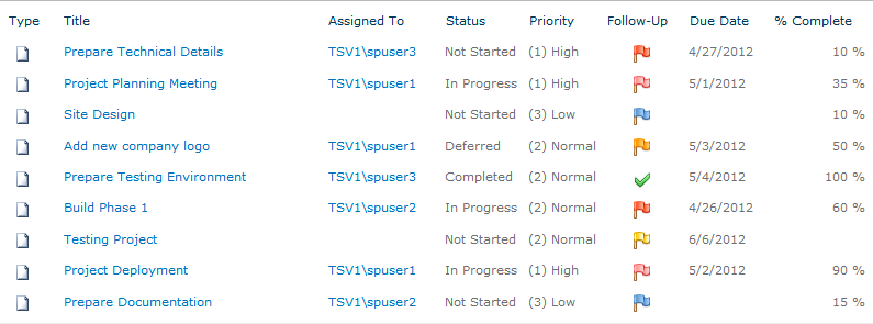
Sparqube Status Indicator can be used to display Follow-up flags similar to flags used in Microsoft Outlook.
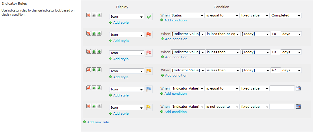
What we want to:
- Display completed flag when task is completed
- Display red flag, when task is overdue (Due Date < Today)
- Display light red flag for tasks with short 3-day time period to due date (Due Date < Today-3)
- Display orange flag for tasks with longer 7-day time period to due date (Due Date < Today-7)
- Display blue flag when due date is not specified (Due Date is empty)
- Display yellow flag in other cases
For this we will add new Sparqube Status Indicator column to Task list and change the following settings:
- Select Icons under Indicator Type box
- In Indicator Value section, set "Due Date" as data source:

- Add indicator rules as shown on screenshot below:
- Add this Sparqube Indicator column to desired list view
Highlight high priority tasks
The following example demonstrates how to add "Important" icon for high priority tasks:

In order to do this, you need to:
- Add Sparqube Status Indicator column to Tasks list
- Set Indicator Type to Icons
- In Indicator Value section, set "Priority" column as data source
- In Indicator Rules section, add one rule that will set "Important" icon for appropriate tasks. This rule should have the following condition: value is equal to "(1) High"
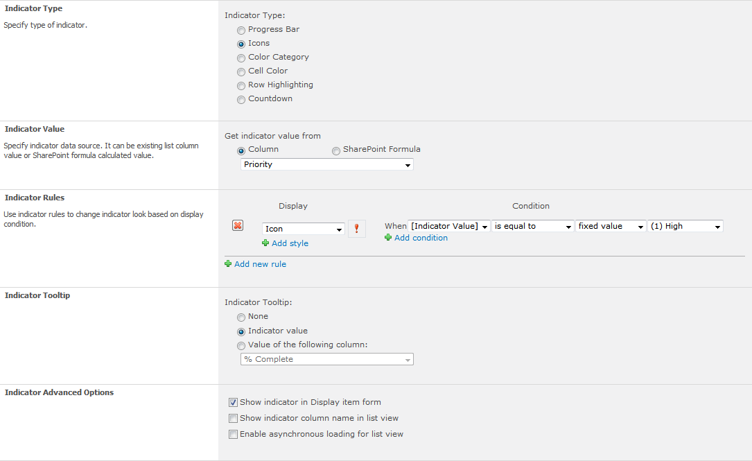
- Add Indicator column for desired list view
Release Notes
Version 1.8
Changes (build 1.8.1605.1701):
- Added: SharePoint 2016 support
Changes (build 1.8.1712.1901):
- Added: Support of deployment to 14 hive on SP2013
Version 1.7
Changes (build 1.7.1501.2101):
- Added: Rule editor is significantly improved
- Fixed: Controls are now MDS-compliant (Minimal Download Strategy)
Changes (build 1.7.1502.201):
- Fixed: Rule condition calculation for empty values
- Fixed: Multiple row highlighters can be used now
Changes (build 1.7.1503.201):
- Fixed: Lookup Classic can now be used as value source
Changes (build 1.7.1504.2402):
- Added: Approval Status and Workflow Status fields can be used as indicator source
- Fixed: Category height setting was disregarded
Changes (build 1.7.1508.2901):
- Fixed: Source filed reference with long name
Changes (build 1.7.1602.2601):
- Fixed: Script loading in grouped view for SharePoint 2010
Version 1.6
Changes (build 1.6.1405.2201):
- Added: Asynchronous rendering
Version 1.5
Changes (build 1.5.1310.2501):
- Added: Bar chart support for Countdown mode
- Fixed: Crash when used in workflows
- Fixed: jQuery conflicts
Version 1.4
Changes (build 1.4.1301.2101):
- Added: Right-to-Left languages support (RTL)
Version 1.3
Changes (build 1.3.1301.301):
- Added: Support for SharePoint 2013
Version 1.1
Changes (build 1.1.1208.701):
- Added: Countdown indicator type
Changes (build 1.1.1209.1101):
Version 1.0
Initial release (build 1.0.1205.2101)
Changes (1.0.1207.2101):
- Fixed: Lookup columns were not referenced by Indicator